Creating truly stylish outfits isn’t just about following trends or owning expensive pieces—it’s about understanding the intricate balance of elements that work harmoniously together. Fashion’s most compelling looks emerge when colour theory meets proportional design, when fabric textures complement rather than compete, and when every detail serves a purpose in the overall composition. This sophisticated approach to dressing transforms ordinary clothing combinations into memorable style statements that transcend seasonal trends.
The art of achieving sartorial balance requires both technical knowledge and intuitive understanding. While many people rely solely on instinct when putting together outfits, those who master the subtle science behind stylish dressing gain access to a more refined and intentional approach. From understanding how colours interact on the Munsell colour wheel to applying mathematical principles like the golden ratio in garment proportions, the foundation of exceptional style lies in these often-overlooked fundamentals.
Colour theory fundamentals in fashion coordination
Mastering colour coordination forms the backbone of sophisticated dressing, yet many fashion enthusiasts overlook the scientific principles that govern successful colour combinations. Professional stylists and designers rely heavily on established colour theory to create visually compelling outfits that feel both intentional and effortless. Understanding these fundamentals allows you to make confident choices that elevate your personal style beyond basic colour matching.
Complementary colour schemes using the munsell system
The Munsell colour system provides a more nuanced approach to complementary colour pairing than traditional colour wheels. This three-dimensional colour space considers hue, value, and chroma simultaneously, offering sophisticated combinations that create visual tension without overwhelming the eye. For instance, pairing a muted sage green blazer with subtle burgundy accessories creates depth through complementary contrast while maintaining elegance.
When applying complementary schemes in everyday dressing, consider the intensity and saturation levels of your chosen colours. A vibrant orange top might pair beautifully with deep navy trousers, but the proportions matter significantly—using the brighter colour as an accent rather than the dominant shade prevents visual discord. This approach mirrors the successful styling techniques seen in contemporary fashion editorials.
Analogous palettes in seasonal wardrobe planning
Analogous colour schemes utilise colours that sit adjacent to each other on the colour wheel, creating harmonious and naturally pleasing combinations. These palettes work exceptionally well for building cohesive seasonal wardrobes, as they allow for multiple pieces to work together seamlessly. Think of the way autumn leaves naturally combine warm oranges, deep reds, and golden yellows—this same principle applies to sophisticated dressing.
Building an analogous palette for your wardrobe might involve selecting pieces in varying shades of blue, from powder blue shirts to navy blazers and denim in different washes. This approach ensures that most items in your wardrobe can be mixed and matched effectively, reducing decision fatigue while maintaining visual interest through subtle tonal variations.
Monochromatic dressing techniques for visual cohesion
Monochromatic dressing extends far beyond wearing all black or all white—it’s about creating sophisticated tonal stories through varying shades, textures, and finishes within a single colour family. This technique creates an elongating effect and demonstrates advanced style sensibility, as it requires careful attention to proportion and texture to avoid appearing flat or monotonous.
Successful monochromatic outfits rely on strategic layering and texture contrast. A camel-toned ensemble might combine a cashmere sweater, wool trousers, and leather accessories in slightly different shades of beige and tan. The key lies in varying the textures and finishes—matte, glossy, textured, and smooth—to create visual interest without breaking the colour story.
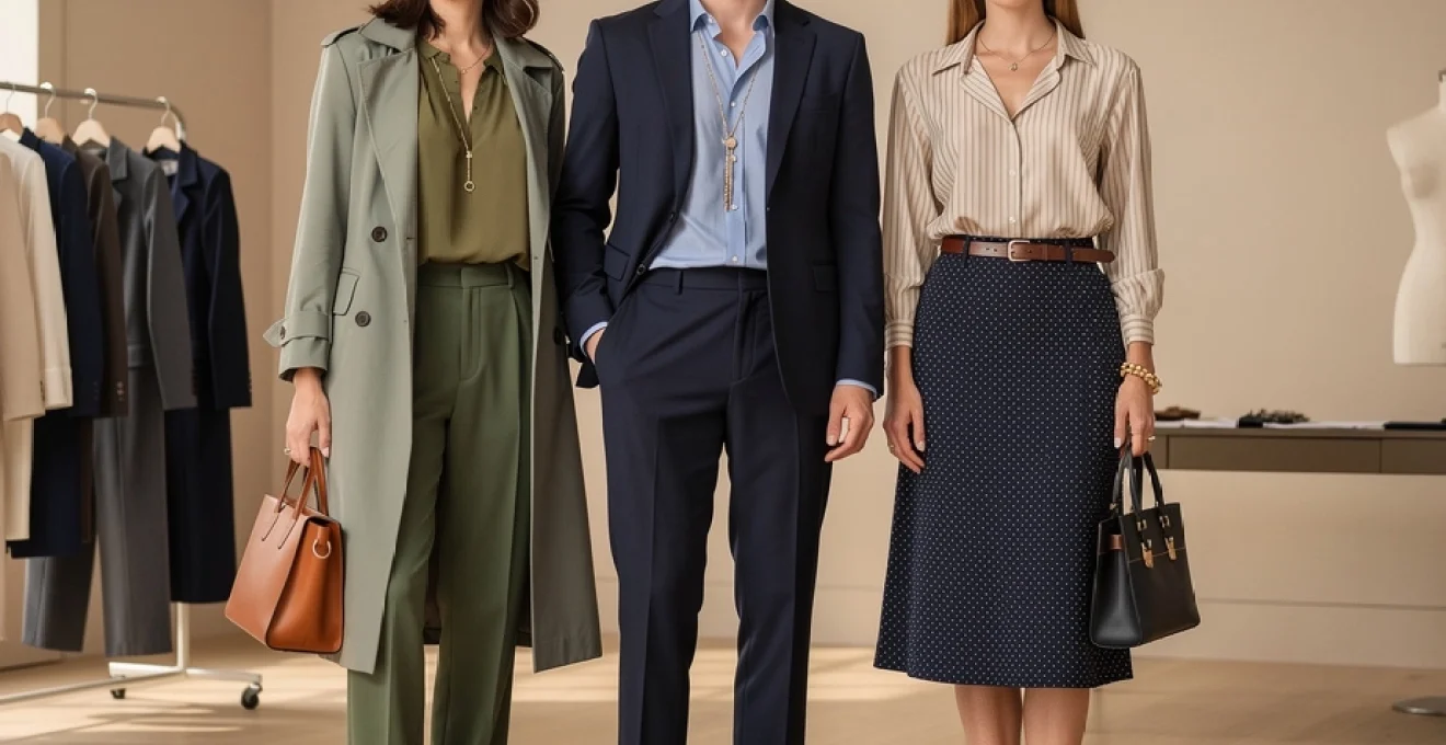
Neutral foundation building with beige, grey, and navy anchors
Neutral anchors form the foundation of versatile, sophisticated wardrobes, but not all neutrals are created equal. The most effective neutral palettes incorporate warm and cool tones strategically, creating depth and preventing the overall look from appearing washed out. Navy serves as an excellent alternative to black, offering more versatility and a softer appearance in daylight.
Building a neutral foundation requires understanding undertones—warm beiges
Building a neutral foundation requires understanding undertones—warm beiges with yellow or peach bases will harmonise differently with your skin and existing wardrobe than cooler greiges or blue-based greys. Grey, for instance, can range from soft, dove tones that pair beautifully with blush and ivory, to charcoal shades that ground brighter hues like cobalt or fuchsia. Navy works as a sophisticated anchor for both businesswear and casual outfits, offering depth without the harshness of head-to-toe black. By selecting two or three core neutral anchors—often beige, grey, and navy—you create a reliable canvas that allows accent colours and statement pieces to shine without competing for attention.
Proportional design principles in silhouette construction
While colour draws the eye first, proportion is what makes an outfit feel inherently “right”. Proportional design in fashion is less about strict body rules and more about creating visual harmony between lengths, volumes, and lines. When we speak about a flattering silhouette, we are often describing looks that intuitively follow mathematical relationships observed in nature, architecture, and art. Understanding these principles allows you to adjust hems, choose jacket lengths, and layer with intention, rather than relying on trial and error every morning.
Golden ratio applications in garment length calculations
The golden ratio—approximately 1:1.618—appears in everything from classical paintings to modern product design, and it can also guide where garments start and end on the body. When applied to outfit building, this ratio helps determine visually pleasing breakpoints, such as where a skirt hem should hit relative to your overall height, or how long a blazer should be in relation to your legs. For example, many people find that skirts or dresses that finish at about 61–62% of the distance from shoulder to floor (often around mid-calf or just below the knee) feel more balanced than those ending at the widest part of the calf.
You can use the golden ratio as a flexible tool rather than a strict rule. Consider the total length of your body as a whole, then experiment with tops that occupy roughly one third of that visual space and bottoms that occupy two thirds, or vice versa. This is why high-waisted trousers paired with a slightly cropped or tucked-in top look so refined: the eye reads a pleasing 1:2 or 2:3 relationship between upper and lower body. Have you ever noticed how a slightly shorter jacket suddenly makes your legs look longer? That is the golden ratio at work in everyday style.
Body geometry analysis for optimal fit selection
Beyond abstract ratios, body geometry—the relationship between your shoulders, waist, hips, and height—plays a critical role in choosing silhouettes that feel balanced. Instead of focusing on traditional “body types”, think in terms of lines and angles: are your shoulders visually broader than your hips, or the reverse? Is your torso proportionally longer than your legs, or do you have a high waist? Analysing these visual relationships helps you decide where to add structure, volume, or softness for optimal fit selection.
For instance, if your shoulders are narrower than your hips, shoulder details like subtle padding, epaulettes, or structured lapels can create equilibrium in your silhouette. Conversely, if your shoulders are broad, soft draping, V-necks, and unstructured jackets can visually soften the upper body. Taller individuals generally handle longer hemlines and oversized pieces with ease, while more petite dressers often benefit from shorter jackets, cropped trousers, and higher waistlines that create upward visual movement. Rather than forcing your body into a trend-driven shape, you use body geometry analysis to select garments that support your natural structure.
Vertical line creation through strategic layering techniques
Vertical lines are among the most powerful tools in fashion styling because they draw the eye up and down, creating an elongating effect and a sense of polish. Strategic layering is one of the easiest ways to create these lines in your everyday outfits. Longline blazers, open cardigans, tailored coats, and even unbuttoned shirts worn over a tonal base all form uninterrupted vertical columns that streamline the silhouette. This is especially effective when the inner layer is darker than the outer layer, as the surrounding light fabric visually “frames” the body.
You can enhance vertical line creation through details such as centre-front seams, long scarves worn loosely, or column dressing in a single colour. A column of black or navy beneath a lighter trench, for example, instantly feels taller and more composed. Even the placement of buttons, zips, and vertical pleats contributes to this effect. Ask yourself: where do I want the eye to travel? If the answer is “upwards”, then emphasising vertical continuity through layers, seams, and openings will quietly support that goal.
Horizontal balance using belt placement and tucking methods
Where vertical lines lengthen, horizontal lines ground and stabilise an outfit—but they must be used thoughtfully. Belts, waistbands, and strong colour blocks can create horizontal breaks that either flatter your proportions or inadvertently shorten your frame. The key is intentional placement. A belt at the natural waist often highlights curves and creates an hourglass effect, whereas a belt worn on the hips can lower the visual centre of gravity, useful if you have a short torso or prefer a more relaxed, low-slung aesthetic.
Tucking methods are another subtle yet powerful way to manage horizontal balance. A full tuck clearly defines the waist and works well with high-rise trousers or skirts, while a French tuck (tucking only the front of the top) creates a softer line that hints at shape without strict definition. Leaving a top fully untucked forms a continuous vertical line, but if the hem cuts across the widest part of the hips, it may feel visually heavy. By experimenting with belt width, buckle scale, and tucking styles, you can fine-tune where horizontal lines appear, ensuring your outfits look considered rather than accidental.
Fabric weight distribution and texture interplay
Fabric choice is often underestimated, yet the weight and texture of what you wear significantly affect how your outfit hangs, moves, and photographs. The most stylish looks balance light and heavy materials, matte and sheen finishes, and smooth and textured surfaces to create visual depth. Think of fabric weight distribution like composing a piece of music: too many heavy notes and the outfit feels dense; too many airy notes and it lacks structure. The art lies in mixing them so the ensemble feels dynamic without chaos.
One effective principle is to anchor lightweight fabrics with more substantial ones. A fluid silk blouse gains authority when paired with structured wool tailoring, while a chunky knit becomes more refined over a slinky satin slip skirt. This interplay of structure and drape ensures that each fabric supports, rather than overwhelms, the others. In warmer months, you might swap wool for crisp cotton or linen, but the underlying logic remains the same: combine at least one fabric with architectural integrity and one with movement for a balanced silhouette.
Texture is equally vital because it controls how light interacts with your outfit. Matte textures like brushed cotton, wool, or raw denim absorb light and recede, while glossy leather, satin, and polished metal catch the eye and advance. Want to highlight a particular area, such as a defined waist or elegant neckline? Introduce a slightly shinier or more textured element there. Conversely, if you prefer a more understated effect on certain areas, keep fabrics matte and low-contrast in those zones.
For everyday styling, a simple guideline is to combine two to three distinct textures per look. For instance, pair a smooth knit with grainy leather and a subtle woven bag, or mix crisp poplin with soft cashmere and polished loafers. This is similar to layering flavours in cooking: each element should contribute something different, but no single ingredient should dominate. As sustainability becomes more central in fashion, understanding fabric behaviour—how it creases, how it wears, how it drapes—also helps you invest in pieces that maintain their shape and elegance season after season.
Scale coordination in pattern and print mixing
Pattern mixing is one of the clearest indicators of advanced styling, yet it can feel intimidating if you do not understand scale coordination. The secret is that successful print combinations rarely rely on random pairing; instead, they balance pattern size, density, and contrast much like a graphic designer balances typography on a page. When you treat prints as visual weights rather than merely decorative motifs, you can mix stripes, florals, and dots with confidence.
Fibonacci sequencing in accessory size progression
The Fibonacci sequence—1, 1, 2, 3, 5, 8, and so on—describes naturally pleasing progressions found in shells, flowers, and even galaxy spirals. In fashion styling, you can apply this idea to the relative scale of accessories to create harmony. Rather than wearing multiple pieces of similar size that compete with one another, you step them up gradually: a small earring, a medium necklace, and a larger bag, for example. This visual “ladder” is more comfortable for the eye to follow than three equally bold items.
Imagine starting with a delicate ring (1), adding a modest pendant (2), then finishing with a structured tote or wide belt (3 or 5 on that imaginary scale). The overall effect is cohesive because each accessory occupies its own level of importance. This is why an oversized cuff bracelet looks intentional when paired with minimal studs, but overwhelming when combined with statement earrings and a chunky necklace. Next time you get dressed, ask yourself: which piece do I want to speak the loudest, and how can I let the others fall into a Fibonacci-like supporting rhythm?
Geometric pattern interaction using polka dots and stripes
Geometric prints like polka dots and stripes are foundational because they behave predictably when combined. The key to mixing them lies in contrast of scale and direction. Thin, closely spaced stripes read as a subtle texture from a distance, making them a perfect backdrop for bolder, larger polka dots. Conversely, large, widely spaced stripes pair best with smaller, more delicate dots to avoid visual overload. It is the interplay between “macro” and “micro” patterns that brings balance to the overall look.
Direction also matters. Vertical stripes elongate, while horizontal stripes stabilise and widen the visual field. Diagonal or chevron stripes introduce movement and energy. Pairing a vertically striped shirt with a polka-dot skirt, for instance, can create a dynamic yet sophisticated outfit, especially if both share at least one common colour. Using a neutral base—like black-and-white stripes with navy dots—allows you to experiment with pattern interaction without sacrificing wearability. Think of it like designing a city skyline: some buildings are tall and narrow, others are short and wide, but together they form a coherent horizon.
Floral print density matching with solid colour ratios
Florals introduce another layer of complexity because they often combine multiple colours and shapes within a single print. To keep them feeling modern rather than overwhelming, pay attention to density (how tightly packed the motifs are) and balance it with the amount of solid colour in your outfit. A dense, ditsy floral blouse, for example, usually pairs best with large areas of solid fabric—plain trousers or a minimal skirt—so the eye has room to rest. A more spaced-out, oversized floral can tolerate additional pattern or texture because it is visually lighter.
A practical rule is the 70/30 ratio: let roughly 70% of the outfit be solid and 30% be print when you are still building confidence with pattern mixing. As you grow more comfortable, you can reverse the ratio or add a second pattern, provided it is smaller in scale and shares at least one colour with the floral. For instance, a navy floral dress with hints of cream looks polished with a cream blazer and navy loafers, subtly echoing the print’s palette. By deliberately matching floral print density with solid colour ratios, you transform potentially chaotic garments into carefully calibrated style statements.
Contemporary style icons mastering sartorial balance
The principles of colour, proportion, texture, and pattern become easier to grasp when we see them embodied by contemporary style icons. Whether they are editors, influencers, or celebrities, the most consistently well-dressed figures rarely rely on shock value alone. Instead, they exhibit a deep understanding of sartorial balance—repeating certain silhouettes, colour palettes, and fabric combinations that work for their lifestyle and body geometry. If you have ever saved an outfit screenshot “for later”, you have already recognised this mastery, even if only subconsciously.
Look at how many modern style leaders favour neutral foundations with one standout element, such as a sculptural shoe or a bold coat. This approach reflects deliberate scale coordination: the statement piece is allowed to dominate because the rest of the outfit is pared back. Similarly, their use of accessories tends to follow the Fibonacci idea in practice—one hero item supported by smaller, quieter pieces. Street style photographs from the major fashion weeks repeatedly show this pattern, suggesting that balance, not excess, is what endures season after season.
These icons also tend to respect their own proportions rather than chasing every micro-trend. You might notice that a particular editor always opts for ankle-grazing trousers and mid-heel boots, or that a certain influencer gravitates towards longline blazers and wide-leg trousers. These are not coincidences but carefully tested formulas that align with their body geometry analysis and personal brand. By studying their recurring outfit combinations rather than one-off show looks, you can reverse-engineer what makes their styling feel so consistently effortless.
Most importantly, contemporary style icons use subtle tension to keep outfits interesting. A structured blazer over a vintage band tee, a delicate slip dress with chunky boots, or a tailored suit worn with a plain white T-shirt all demonstrate how contrast—soft versus sharp, feminine versus utilitarian—creates depth without chaos. This tension is the same balance of elements you are learning to manage: colour against neutral, drape against structure, print against solid. Once you begin to see outfits through this lens, your Instagram saves folder becomes not just inspiration, but a practical textbook in modern style.
Advanced styling techniques from fashion week runways
Runway collections are often described as “editorial” or “unwearable”, yet beneath the theatrics lie advanced styling techniques that translate remarkably well to everyday wardrobes. Designers and stylists use the catwalk as a laboratory to test how far proportion, colour theory, and texture interplay can be pushed while still feeling cohesive. When you strip away the exaggerated accessories or avant-garde layering, what remains are clear principles of balance that you can apply at a more subtle scale.
One recurring technique is the intentional disruption of symmetry. Asymmetric hemlines, one-shoulder tops, and off-centre closures all create focal points that guide the viewer’s gaze, much like a painter uses highlights on a canvas. On the runway, these elements are often amplified, but in day-to-day dressing, a simple asymmetrical skirt or wrap blouse can introduce that same sense of movement and modernity. The key is to keep the rest of the look relatively streamlined so the asymmetric detail reads as a deliberate design choice, not a mistake.
Layering is another area where runway styling offers valuable lessons. Fashion week looks frequently feature “sandwich” layering—lightweight base, structured middle layer, and soft outer layer—that mirrors the logic of fabric weight distribution. You might see a silk dress grounded with a tailored blazer and topped with an oversized coat, a combination that manages to be both dramatic and balanced. Translated into everyday wear, this could mean pairing a fitted T-shirt with a boxy jacket and a longline trench, using varying lengths and weights to build dimension without bulk.
Finally, runway shows demonstrate how controlled repetition creates cohesion. A single accent colour echoed in shoes and a small bag, a recurring metal tone across jewellery and hardware, or a repeated motif that appears in both print and silhouette all contribute to a unified story. This is similar to using a leitmotif in music: the repeated element ties the composition together, no matter how complex the arrangement becomes. When you get dressed, consider choosing one thread—maybe a shade of burgundy, a gold hardware theme, or a particular fabric like leather—and weaving it subtly through two or three elements of your outfit.
As you observe future runway seasons, try asking yourself different questions: Where are the vertical lines? How are they using neutrals to anchor bolder shades? Which piece sets the scale for everything else? Approaching fashion week imagery with a stylist’s eye turns high-concept looks into practical lessons. Over time, you build an internal library of advanced styling techniques that you can apply instinctively, allowing you to strike that subtle balance behind truly stylish outfits—no matter your budget, size, or personal aesthetic.