Fashion exists as more than colour palettes and silhouettes—it’s a tactile experience that engages the senses and communicates volumes about personal style. The surface quality of fabrics, from the smoothness of silk charmeuse to the rugged grip of heavyweight denim, introduces a dimension often overlooked by those focused solely on fit and hue. When you master the interplay of different textile surfaces, you unlock the ability to transform even the most basic wardrobe staples into visually compelling ensembles that radiate sophistication. The strategic combination of contrasting fabrics creates dimensional depth that photographs beautifully and feels intentional in person, elevating your appearance from simply dressed to impeccably styled.
Understanding how different materials interact visually requires both knowledge of textile construction and an appreciation for how surfaces catch and reflect light. A smooth satin blouse worn beneath a chunky cable-knit cardigan creates contrast that draws the eye, whilst a monochromatic outfit composed entirely of similar finishes can appear flat and uninspired. The most memorable outfits typically feature at least two distinct surface treatments working in harmony—perhaps the plush softness of velvet against crisp cotton shirting, or the sleek polish of leather trousers paired with an airy linen shirt. This conscious layering of different tactile elements transforms ordinary combinations into sophisticated compositions that showcase an elevated understanding of dress.
Understanding textile weight and drape for strategic layering
The physical properties of fabrics—their heft, flexibility, and how they fall against the body—fundamentally shape how successfully you can combine multiple pieces. Lightweight materials like silk georgette and cotton voile possess an ethereal quality that contrasts beautifully with heavier woolens and structured cottons. When you understand these characteristics, you can build outfits that feel balanced rather than overwhelming, with each layer contributing to the overall harmony of the ensemble. The key lies in recognising that not all textiles play well together; some combinations create visual discord whilst others achieve that effortless sophistication that appears deceptively simple.
Manipulating fabric density: from gossamer silks to heavy wool melton
Fabric weight exists on a spectrum from barely-there chiffons weighing mere grams per square metre to substantial double-faced wool meltons that can exceed 600 grams. This variation offers tremendous creative potential when constructing layered outfits. A gossamer silk camisole worn beneath a structured blazer creates intriguing contrast—the substantial outerwear frames and supports the delicate underlayer, preventing it from appearing insubstantial. Similarly, pairing lightweight modal jersey with heavyweight selvedge denim achieves balance through opposition, with each textile’s characteristics enhanced by proximity to its counterpart.
Consider how a medium-weight merino wool jumper can serve as the perfect intermediary between a crisp cotton shirt and a substantial overcoat. This graduated layering—from lightest to heaviest—creates visual logic that the eye finds pleasing. The technique proves particularly valuable during transitional seasons when temperature fluctuations demand adaptable wardrobes. You might begin your day in a lightweight silk blouse layered under a mid-weight cardigan, adding a heavier wool coat for evening chill. This progression feels natural because it respects the inherent properties of each textile whilst creating dimensional interest through varied surface qualities.
Mastering drape coefficients in fluid fabrics like tencel and viscose
Drape refers to how fabric falls and moves against the body, determined by factors including fibre content, yarn construction, and weave structure. Tencel lyocell and viscose rayon possess exceptional drape qualities—they flow gracefully, creating soft folds that skim rather than cling. These characteristics make them ideal for pieces meant to add movement and fluidity to an outfit. When you pair a drapey Tencel dress with a more structured leather jacket, the contrast between rigid and fluid creates compelling visual tension that elevates both pieces beyond what either could achieve alone.
Understanding drape coefficients helps you avoid common styling pitfalls. Combining multiple highly drapey fabrics can result in an outfit that appears too soft and undefined, lacking the structure necessary for a polished appearance
Instead, anchor those fluid pieces with at least one element that has clearer structure: think a softly draped viscose blouse tucked into crisp cotton chinos, or a bias-cut Tencel skirt topped with a sharply tailored blazer. You maintain the elegance and movement of high-drape fabrics while ensuring the overall outfit still reads as intentional and composed. Pay attention, too, to where the drape breaks—at the shoulder, hip, or ankle—as these points subtly direct the eye and can be used to highlight or downplay specific areas of your figure.
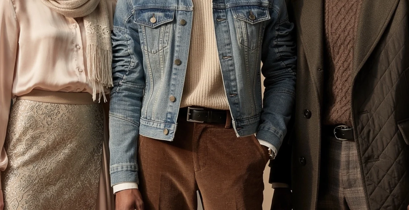
Combining structured textiles: denim, canvas, and heavyweight cotton twill
At the opposite end of the spectrum from fluid viscoses and silks sit structured textiles like denim, canvas, and heavyweight cotton twill. These fabrics hold their shape, creating crisp lines and architectural silhouettes that become the backbone of many wardrobes. When you understand how to use these structured textiles strategically, you can build outfits that feel grounded and intentional, providing a stable framework for softer, more delicate textures to play against.
Denim is often your most accessible structured fabric, functioning almost like a neutral in terms of both colour and texture. Raw or rigid denim, heavyweight chino, and dry-finished canvas jackets all introduce a certain stiffness that can be extremely flattering when you want to define the torso or create a clean leg line. Pair a boxy canvas utility jacket with a slinky ribbed knit dress, and the contrast between the garment that stands away from the body and the one that clings creates a compelling push-pull effect.
Because these fabrics resist draping, you can also use them to correct an outfit that feels too “soft” or unstructured. If you look in the mirror and feel lost in layers of floaty viscose and jersey, adding a denim jacket, a twill trench, or structured cotton cargo trousers will instantly give the look more definition. The key is to let these sturdier pieces anchor your silhouette while allowing at least one softer fabric to bring movement and nuance.
Balancing body-skimming and voluminous silhouettes through textile selection
Texture is not only about what a fabric feels like—it also directly informs silhouette. Heavier, stiffer textiles will naturally create more volume and space around the body, while lighter knits and fluid wovens tend to skim and follow your shape. Learning to balance body-skimming and voluminous pieces through textile choice is one of the most effective ways to add depth and personality to your outfits without resorting to bold prints.
Think of it as composing a visual rhythm. If your top half is dominated by volume—a cocoon wool coat, an oversized mohair cardigan, or a padded gilet—keep the bottom half more streamlined with ponte leggings, slim denim, or a pencil skirt in a compact knit. Conversely, if you are wearing wide-leg canvas trousers or a full A-line skirt in heavy twill, choose a finer, closer-fitting top in merino, jersey, or silk to restore equilibrium. This interplay between expansion and containment creates a silhouette that feels dynamic rather than bulky.
Body-skimming fabrics also help when you are layering multiple textures. A fitted turtleneck in lightweight wool or a second-skin ribbed top in modal forms a smooth base that allows voluminous layers—like a chunky cardigan or a quilted coat—to sit cleanly on top. Instead of all your fabrics fighting for space, the outfit reads as deliberate: a streamlined core surrounded by sculptural, textural interest. Ask yourself: where do you want the eye to rest, and which parts of your body do you want to feel cocooned versus defined?
Tactile contrast techniques: mixing surface finishes within single ensembles
Once you understand how textile weight and drape influence structure, you can begin to refine your looks through surface contrast. Surface finishes—matte, glossy, brushed, pebbled, fluffy—are what make an outfit feel multi-dimensional, especially in real life and in photographs. Thoughtful combinations of different fabric finishes within one ensemble can make even a capsule wardrobe of neutrals feel endlessly interesting, giving your outfits that “styled, not just thrown on” quality.
Pairing smooth leather and suede with chunky cable-knit woolens
Few texture pairings feel as timeless as leather (or faux leather), suede, and chunky knitwear. Smooth leather introduces a sleek, almost liquid shine that acts like a visual exclamation mark, while suede offers a softer, brushed version of the same idea. When set against the irregular, tactile surface of a cable-knit jumper, both materials come alive. The wool absorbs light; the leather reflects it. Together, they create a rich, high-low balance that is particularly effective in cold-weather dressing.
To keep this combination wearable for everyday outfits, focus on proportion and placement. A leather pencil skirt with an oversized Aran knit, or slim leather leggings with a slouchy fisherman jumper, balance polish and coziness. Alternatively, use accessories if a full leather piece feels too bold for your style personality: a suede boot with a chunky cardigan and simple denim still provides a strong tactile story. Notice how this approach allows you to build outfits that feel luxurious without relying on colour or print.
For those experimenting with leather textures for the first time, think in terms of one hero leather or suede element per look. Too many pieces in the same finish can quickly veer into costume territory. A single leather biker jacket thrown over a thick wool roll-neck, or suede ankle boots grounding an otherwise soft, knitted dress, offers tactile contrast that feels natural and modern.
Incorporating metallic brocade and jacquard weaves with matte jersey
Metallic brocades and jacquard weaves bring drama through both pattern and surface—their raised motifs and subtle shimmer immediately read as special-occasion. Yet these textiles do not need to be reserved exclusively for evening events. When you mix them with humble, matte jersey, they become surprisingly wearable, lending everyday outfits a tailored, fashion-forward twist without feeling over-dressed.
The trick lies in contrast. A brocade mini skirt with a simple black cotton jersey t-shirt, or a jacquard bomber layered over a plain ribbed tank and jeans, creates a deliberate tension between opulent and casual. Matte jersey acts almost like visual “grounding”, smoothing out the formality of metallic threads in the same way that a neutral wall calms a bold piece of art. This pairing is particularly effective if you enjoy minimalist silhouettes but still want your outfits to feel expressive.
If you are worried about such rich textures feeling too rigid or scratchy, look for pieces where the brocade or jacquard is backed with a softer lining or combined with elastane for ease. You might also restrict the metallic textile to smaller areas—collars, cuffs, or a panel on a dress—while allowing the rest of the garment to remain in forgiving jersey. You maintain comfort and movement, but the glimmering detail adds depth and personality.
Juxtaposing shearling and faux fur against crisp poplin shirting
Shearling and faux fur instantly add volume, warmth, and a sense of tactile indulgence. On their own, however, they can occasionally feel too plush or bohemian for more tailored or minimalist wardrobes. Enter crisp cotton poplin shirting. This smooth, tightly woven textile offers a clean, almost architectural backdrop against which the softness of shearling or faux fur can really shine. The result is a chic juxtaposition: think sharp lines and soft edges in one outfit.
A classic example is a white poplin button-down peeking out from beneath a teddy-bear coat or shearling gilet. The shirt collar and cuffs introduce structure and a hint of formality, preventing the outer layer from feeling like loungewear. Similarly, a faux-fur bomber jacket thrown over a striped poplin shirt and dark-wash jeans turns into a considered, street-ready look rather than something purely whimsical. Here, the contrast in texture is doing the majority of the styling work.
If you prefer subtlety, even a small amount of poplin—say, a shirting placket on a dress or a poplin-panelled sweater—can temper the fullness of furry surfaces. Ask yourself which item you want to read as the “statement” and allow the other to play a supporting role. Shearling and faux fur tend to dominate, so keeping your shirt in a solid, classic cut and neutral tone helps maintain balance.
Integrating patent leather and vinyl with soft cashmere blends
Patent leather and vinyl introduce a high-shine, reflective surface that is inherently bold. They catch light dramatically, drawing instant attention to whatever part of the body they cover. To keep these glossy textures sophisticated rather than stark, pair them with the most tactilely luxurious fabrics you can find—cashmere, merino, brushed alpaca, or lofty mohair. This combination of slick and plush creates an outfit that feels both directional and inviting.
Consider the effect of patent ankle boots worn with a cloud-soft cashmere midi dress. The boots inject a modern edge, while the dress maintains warmth and approachability. Similarly, a vinyl trench layered over a fine-gauge cashmere turtleneck and wool trousers turns a potentially intimidating textile into a wearable statement. You are essentially tempering the “hardness” of the gloss with the comforting softness of knitwear.
Because patent and vinyl reflect so much light, they can dominate an outfit quickly. Limit yourself to one or two glossy elements—a bag and shoes, a skirt, or a coat—and keep the remaining fabrics in your look more matte and brushed. This not only prevents your outfit from feeling overwhelming, it ensures that each texture has space to be noticed and appreciated.
Weave pattern differentiation: creating visual interest through fabric construction
Beyond fibre type and surface finish, the way a fabric is constructed—the actual weave or knit pattern—adds another layer of interest to your outfits. Subtle variations in weave can create depth even when all your pieces are in the same colour. Learning to recognise and combine different constructions allows you to compose looks that feel intricate and intentional without relying on obvious prints.
Contrasting plain weave with herringbone and houndstooth patterns
Plain weave fabrics, like standard cotton poplin or many linens, have a simple over-under structure that reads as smooth and unassuming. In contrast, twill-based patterns such as herringbone and houndstooth introduce diagonal movement and small-scale motifs that catch the eye. When you place these weaves side by side—say, a plain weave shirt under a herringbone blazer—you create visual depth that feels refined rather than busy.
This is particularly powerful if you prefer classic or corporate dressing but still want your outfits to feel considered. A charcoal houndstooth coat over a plain black trouser and white shirt combination adds quiet complexity through texture instead of colour. Because these patterns are woven rather than printed, they often feel more timeless and less trend-driven, making them smart investments in a long-term wardrobe.
To stop the look from becoming overwhelming, vary the scale of the patterns and give the eye somewhere to rest. If your outer layer features a bold houndstooth, keep anything closer to the body in plain weaves or very fine textures. The interplay between patterned and smooth surfaces will provide all the interest you need.
Mixing rib-knit structures with bouclé and slub yarn textures
Knits offer an entire world of texture variation, from sleek jersey to heavily textured bouclé. Rib-knit structures—vertical lines of pronounced knit and purl stitches—are particularly useful in outfit building because they visually elongate the body and gently hug the figure. When paired with the irregular loops of bouclé yarns or the uneven surface of slub knits, they create a layered, touchable effect that is ideal for cozy, elevated casual looks.
Imagine a ribbed turtleneck layered under a bouclé cardigan, or slub-yarn joggers worn with a fine ribbed tank and a smooth wool coat. Each knit tells a different textural story, yet they remain in the same family, which keeps the outfit cohesive. This is an excellent approach if you favour monochrome or tonal palettes, as the variation in knit structures does the work that contrast colours or prints might typically do.
If your style leans more minimal, focus on one highly textured knit at a time. A bouclé jacket over a ribbed dress, for example, showcases both textures without feeling fussy. The key is to pay attention to the scale of the texture: small, tight ribs read as subtler than exaggerated, chunky ones, so choose accordingly based on how bold you want your final look to appear.
Combining satin weave lustrous finishes with basketweave cotton
Satin weaves—whether in silk, polyester, or viscose—are characterised by their smooth, lustrous surfaces. Basketweave cottons, on the other hand, display a grid-like texture that feels more casual and grounded. When you combine these weaves, you bring together luxury and ease in a way that is perfect for modern, mixed-dress-code lifestyles where day and evening often blur into one another.
A satin camisole tucked into basketweave cotton trousers, or a satin-weave skirt paired with a boxy basketweave cotton shirt, merges two different tactile worlds. The satin catches light and adds a hint of glamour, while the more textured cotton keeps the outfit appropriate for daytime or creative work environments. This kind of pairing is especially effective in neutral or muted colour palettes, where the eye relies on texture rather than hue for stimulation.
To maximise the impact, be mindful of sheen distribution. If your satin piece is particularly glossy, keep the rest of your outfit matte or softly textured to avoid visual overload. Conversely, a subtler satin finish can be layered with additional lustrous accents—like a polished leather belt or a silk scarf—without tipping the balance.
Dimensional embellishment strategies: raised surface treatments and applications
Beyond inherent fabric texture, raised surface treatments—embroidery, quilting, beading, and more—add three-dimensional interest that can dramatically change the mood of a garment. Think of these embellishments as architectural details on a building: they do not alter the structure itself but profoundly influence how we perceive it. Used thoughtfully, they can turn simple wardrobe items into conversation pieces while still remaining wearable and versatile.
Incorporating embroidery, appliqué, and beadwork on base garments
Embroidery, appliqué, and beadwork introduce intricate, raised patterns that instantly elevate otherwise simple textiles. A plain cotton shirt with tonal embroidery along the yoke, or a minimalist wool coat with discreet beaded cuffs, offers depth and personality without overwhelming the wearer. Because these details are often applied in specific areas, you can use them to draw attention to or away from particular parts of the body.
When working these embellishments into your wardrobe, start with one detailed piece per outfit, allowing the rest of your garments to remain comparatively understated. For example, an embroidered denim jacket over a simple t-shirt and tailored trousers feels chic but relaxed. Likewise, a beaded neckline on a jersey dress eliminates the need for a necklace while adding subtle sparkle and texture.
If you worry about embellished pieces skewing too formal, look for styles where the thread or beads are close in colour to the base fabric. Tonal embroidery reads more like texture than decoration, making it easier to pair with casual items like sneakers or flat boots. In this way, embellishment becomes a tool for creating depth rather than a signal of formality.
Utilising quilting and padding techniques for sculptural volume
Quilting and padding techniques introduce both visual pattern and literal volume, creating garments that stand slightly away from the body in a sculptural way. From classic diamond-quilted jackets to fashion-forward padded vests and skirts, these pieces add a tactile, cocooning element that can be surprisingly flattering when balanced correctly. The stitched lines guide the eye, while the padded interiors add dimensionality and warmth.
To make quilted textures work in everyday outfits, pair them with smoother, more fitted layers. A quilted liner jacket over a slim turtleneck and straight-leg jeans, or a padded skirt with a fine-gauge knit, keeps the look intentional rather than bulky. You are essentially allowing the quilting to be the “hero” texture, with other fabrics acting as a quiet foundation.
Consider, too, how quilting can modernise familiar silhouettes. A quilted trench coat in a matte cotton or technical fabric offers the drama of a classic trench with added depth. For those in milder climates, lightly padded gilets or vests worn over shirts or lightweight sweaters let you play with volume and texture without overheating.
Integrating fringe, tassels, and macramé details for movement
Fringe, tassels, and macramé details add a dynamic dimension to outfits: movement. As you walk or gesture, these elements sway and shift, catching light and drawing attention. Used in moderation, they can inject personality and a sense of playfulness into even the most neutral ensembles. Think of them as kinetic texture—alive and constantly changing.
A fringed suede bag with a tailored wool coat, or a macramé belt cinching a simple shirt dress, introduces bohemian flair without overwhelming the outfit. Similarly, a jumper or jacket with tasselled hems or fringed sleeves can be surprisingly versatile when the rest of your look remains clean and pared-back. The contrast between static, structured fabrics and flowing, mobile details creates a compelling visual story.
If you are new to these kinds of embellishments, begin with accessories rather than full garments. A pair of earrings with tiny tassels or a scarf with a macramé border allows you to experiment with movement and texture in small doses. Once you understand how much “animation” feels right for your personal style, you can graduate to larger fringed or knotted pieces.
Deploying ruching, smocking, and pleating for three-dimensional effects
Ruching, smocking, and pleating manipulate fabric into folds and gathers, adding three-dimensional texture that also influences fit. These techniques can define the waist, add volume at the bust or hips, or create rhythmic vertical lines that elongate the body. In essence, they allow you to sculpt the silhouette using nothing more than strategic fabric manipulation.
A smocked bodice on an otherwise simple dress, for instance, provides stretch, comfort, and visual interest while eliminating the need for heavy structure. Knife pleats in a skirt create a fluid, swaying effect that catches the light with each step, whereas soft ruching along a side seam can gently camouflage areas you might feel self-conscious about. When combined with smooth, unadorned fabrics elsewhere in your outfit, these details stand out as intentional design features.
Because ruching and pleating add bulk where they are applied, consider placement carefully. Use them where you’d like to draw the eye or add softness, and balance them with more streamlined pieces. A pleated skirt works beautifully with a sleek turtleneck; a ruched top benefits from simple, straight trousers or jeans. This ensures your three-dimensional details read as sculptural rather than fussy.
Seasonal texture transitions: adapting tactile combinations across climate zones
Texture is intimately linked to seasonality. Certain fabrics not only feel more appropriate in specific weather conditions but also visually signal the time of year. By adjusting your textural combinations as temperatures shift, you can keep your wardrobe feeling fresh and intentional without constantly buying new pieces. The goal is to understand how to adapt your favourite textures so they feel seasonally aligned, whether you live in a cold climate or somewhere with barely-there winters.
Summer texture palettes: linen, seersucker, and eyelet cotton broderie anglaise
In warm weather, lighter textures that allow the skin to breathe become essential. Linen, seersucker, and eyelet cotton (broderie anglaise) are particularly effective because they combine practicality with visual interest. Linen’s natural slubs create a relaxed, lived-in texture; seersucker’s puckered stripes lift the fabric away from the skin; and eyelet introduces tiny cut-outs that add both airflow and intricate pattern.
When you mix these summer textures, you can build outfits that feel cohesive yet multi-dimensional. A linen shirt with seersucker shorts, or a broderie anglaise blouse tucked into plain cotton trousers, balances airy openness with subtle tactile detail. Because these fabrics typically come in light or neutral colours, they work beautifully in monochromatic looks where texture is the main protagonist.
If you are transitioning from cooler seasons, think of swapping heavy knits for open-weave crochet, dense denim for lighter chambray, and brushed cotton for crisp poplin. The overarching principle remains the same: combine at least two different surface qualities in each outfit—perhaps linen with smooth silk, or eyelet with compact jersey—so your summer looks remain as layered and interesting as your winter ones, even with fewer physical layers.
Winter layering with mohair, alpaca, and brushed flannel compositions
Cold-weather dressing invites richer, more enveloping textures. Mohair and alpaca bring a halo-like fuzziness that reads as instantly cosy, while brushed flannel offers a soft, velvety surface that sits close to the body. Layered together, these fabrics create depth not only through colour and silhouette but also through their varying degrees of softness and loft.
For instance, a brushed flannel shirt under an alpaca cardigan, topped with a structured wool coat, delivers three distinct tactile experiences that still function harmoniously. The flannel feels smooth and warm against the skin, the alpaca adds fuzzy volume, and the coat introduces tailored structure. This is precisely how you can add personality to winter outfits that might otherwise default to purely functional puffer jackets and jeans.
In particularly cold climates, consider how technical fabrics can enter the textural conversation as well. Matte down shells, soft-shell jackets, and fleece linings each have unique surfaces that can complement traditional natural fibres. Pairing a sleek technical parka with chunky mohair accessories, or brushed flannel trousers with a minimal puffer, keeps your cold-weather wardrobe both practical and visually compelling.
Transitional season mixing: corduroy, chambray, and ponte roma knits
Transitional seasons—spring and autumn—are where textural play becomes most useful. Temperatures fluctuate, and your outfits must bridge the gap between breezy and insulated. Corduroy, chambray, and ponte Roma knits excel here. Corduroy’s ridged surface feels autumnal without the weight of full winter wool; chambray offers the look of denim with a lighter hand; and ponte provides structure and stretch in a single, polished package.
You might, for example, pair a chambray shirt with fine-wale corduroy trousers and a ponte blazer. Each fabric offers a different tactile experience, yet they share enough visual weight to feel seasonally appropriate. Because none of these textures are extremely heavy, you can add or remove layers as the day warms and cools, without your outfit ever looking out of place.
If you lean towards a minimalist wardrobe, choose transitional pieces in neutral tones—camel corduroy, indigo chambray, black or navy ponte—and let the textures do the talking. As you move from summer linens to winter wools, these fabrics can act as bridges, extending the wear of both light and heavy pieces while keeping your textural combinations interesting.
Colour interaction with textural elements: optical depth through surface variation
Colour and texture are inseparable partners in style. The same shade of black will look completely different in matte jersey, high-shine satin, or brushed wool. By considering how your fabric choices interact with colour, you can create optical depth—outfits that appear layered and nuanced even when composed of only one or two hues. This is especially powerful if you favour neutral or monochromatic wardrobes but still want your looks to feel expressive.
Monochromatic schemes enhanced by contrasting fabric finishes
Monochromatic dressing—wearing a single colour from head to toe—is a favourite technique among stylists because it elongates the body and looks effortlessly chic. Yet without textural contrast, it can also risk feeling flat. The solution is to vary fabric finishes within that single colour family. A charcoal wool coat over a charcoal silk blouse and charcoal denim, for example, reads as sophisticated precisely because each piece catches light differently.
When building monochrome outfits, aim for at least two, preferably three, distinct textures. You might combine matte cotton with glossy leather, or brushed cashmere with crisp poplin and smooth jersey. Ask yourself: if you converted this outfit to black-and-white photography, would the different surfaces still be distinguishable? If the answer is yes, your texture combination is likely working.
This approach is particularly effective in black, navy, and white, where differentiation often relies more on surface than on subtle shifts in hue. By mixing finishes—velvet with silk, denim with chiffon—you keep monochromatic dressing fresh, refined, and very personal.
Tonal dressing with varied textures in camel, ivory, and charcoal palettes
Tonal dressing—combining several shades of the same colour family—offers even more nuance than strict monochrome. Palettes like camel, ivory, and charcoal are especially forgiving and timeless, making them ideal playgrounds for texture. When you layer multiple tones and multiple textures within one palette, you create an outfit that feels rich and deliberate without a single loud element.
Picture an ivory cable-knit jumper with cream satin trousers and an ecru wool coat: three variations of “off-white,” yet entirely different tactile experiences. Or consider a charcoal ponte dress under a light grey brushed wool coat, grounded with dark graphite suede boots. The subtle gradations in shade combined with varied textures draw the eye in, inviting a closer look at the materials and construction.
To keep tonal outfits cohesive rather than chaotic, limit yourself to one or two statement textures (like heavy bouclé or pronounced cable knits) and let the remaining pieces be smoother. You want the palette to feel like a gentle ombré of hues, with texture adding depth rather than noise. This is one of the most elegant ways to add personality to neutral wardrobes.
Using reflective and matte surfaces to amplify colour saturation
Finally, consider how reflective and matte surfaces influence the intensity of colour. Glossy fabrics—satins, patents, certain technical nylons—tend to make colours appear more saturated and vibrant because they bounce light directly back to the viewer. Matte and brushed fabrics—suede, brushed cotton, flannel, many wools—absorb more light, softening and slightly muting the same hue. By combining both within one outfit, you can sculpt how a colour is perceived.
For example, a deep forest-green satin skirt will look richer and more jewel-like when contrasted with a matte green cashmere jumper in a slightly lighter tone. The eye reads the difference in reflection as depth, making the overall look more dynamic. Similarly, a burgundy patent shoe against a matte wool trouser amplifies the shoe’s colour and texture, even if both items are technically the same shade.
If you adore bold colours but worry about them feeling overpowering, consider wearing the brightest, glossiest versions in smaller areas—shoes, bags, trims—while keeping larger garments in matte or semi-matte finishes. This way, you can harness the power of reflective surfaces to highlight your favourite hues without letting them dominate the entire look. Over time, you will find that understanding this interplay between colour and texture gives you far more control over the mood and impact of every outfit you create.