Bold colours possess an undeniable power to transform any ensemble from ordinary to extraordinary, yet mastering their application requires finesse and strategic understanding. The fashion industry has witnessed a remarkable shift towards vibrant, saturated hues that command attention whilst maintaining sophistication. From runway shows to street style photography, bold colour applications have evolved from risky fashion statements to essential wardrobe elements that communicate confidence, creativity, and personal brand identity.
The challenge lies not in avoiding bold colours altogether, but in understanding how to harness their intensity without creating visual chaos. Professional stylists and fashion designers employ specific techniques to balance chromatic intensity with wearability, ensuring that bold colour choices enhance rather than overwhelm the wearer’s natural attributes. These methods, rooted in colour theory and refined through years of industry experience, provide a framework for incorporating vibrant hues into everyday wardrobes with confidence and sophistication.
Colour theory fundamentals for High-Impact fashion styling
Understanding colour theory forms the foundation of successful bold colour styling, providing the scientific framework that distinguishes between haphazard colour choices and intentional, sophisticated combinations. The colour wheel serves as your primary navigation tool, revealing relationships between hues that create harmonious or dramatically contrasting effects. Professional stylists rely on these fundamental principles to create visually striking ensembles that maintain balance and coherence despite their bold nature.
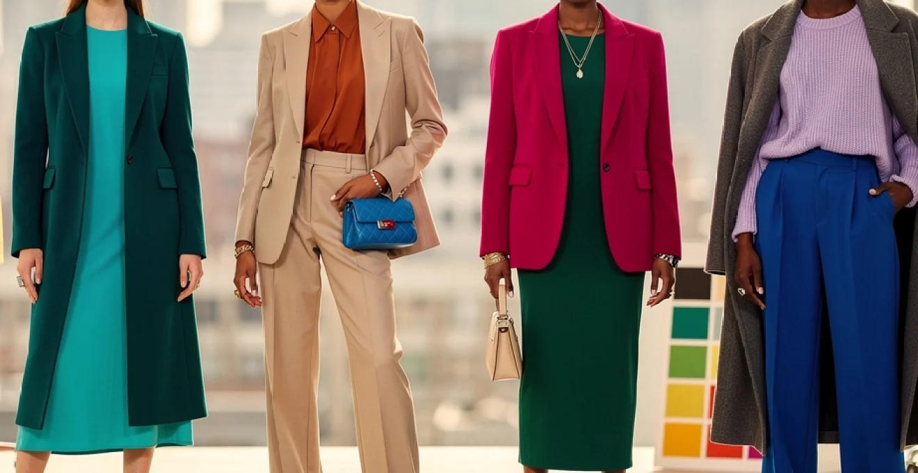
Understanding the 60-30-10 rule for bold colour distribution
The 60-30-10 rule represents one of fashion’s most reliable formulas for colour distribution, particularly when incorporating bold hues into your wardrobe. This principle dictates that 60% of your outfit should consist of a dominant colour (typically neutral), 30% should feature a secondary colour (where bold choices shine), and 10% should comprise accent colours through accessories or details. This mathematical approach ensures visual balance whilst allowing bold colours to make their intended impact without overwhelming the overall aesthetic.
When applying this rule with bold colours, consider using neutral tones like charcoal, navy, or cream as your dominant 60% foundation. Your bold colour choice occupies the 30% space through statement pieces such as blazers, trousers, or dresses. The remaining 10% provides opportunities for complementary accent colours through shoes, handbags, or jewellery, creating depth and visual interest without competing with your primary bold statement.
Chromatic intensity scales and saturation balance techniques
Chromatic intensity refers to the purity and vibrancy of a colour, whilst saturation describes how much grey has been mixed into the hue. Understanding these concepts allows you to manipulate the visual weight of bold colours in your outfits. High-intensity, fully saturated colours like electric blue or vivid fuchsia carry significant visual weight and should be balanced with lower-intensity companions or neutrals to prevent overwhelming effects.
Professional stylists often employ desaturation techniques by pairing highly saturated bold colours with their more muted counterparts. For instance, pairing a vibrant emerald green with sage green creates tonal harmony whilst maintaining visual interest. This approach allows you to embrace bold colours without sacrificing sophistication or wearability in professional or formal settings.
Complementary colour pairing strategies using pantone references
Complementary colours sit opposite each other on the colour wheel and create high-contrast combinations that naturally balance each other’s intensity. When working with bold colours, complementary pairings offer the most dramatic yet harmonious results. For example, pairing Pantone’s “Living Coral” with its complement, a deep teal, creates visual tension that remains pleasing to the eye due to their natural colour theory relationship.
However, using pure complementary colours at full saturation can create visual vibration effects that appear harsh. Professional styling techniques involve adjusting the saturation levels of one or both colours, perhaps using a bold coral paired with a muted sage green, or incorporating neutral barriers between complementary colours to soften their interaction whilst maintaining their dynamic relationship.
Analogous colour schemes for sophisticated bold statements
Analogous colour schemes utilise colours that sit adjacent to each other on the colour wheel, creating harmonious combinations that feel naturally cohesive. This approach proves particularly effective for bold colour applications,
offering a refined, gradient-like effect rather than a stark contrast. Think of an outfit moving from fuchsia to magenta to deep berry, or from cobalt through teal to emerald. Because these hues share undertones, they read as a single, sophisticated story, even when each individual piece is bold. This is one of the most reliable ways to wear multiple strong colours without looking over-styled or theatrical.
To build an analogous bold colour outfit, start by choosing a central hue that flatters your skin tone, then expand one or two steps left and right on the colour wheel. For example, if your hero colour is cobalt, neighbouring shades might include royal blue and teal. Keep silhouettes clean and fabrics elevated so the focus stays on the bold colours rather than fussy details. When in doubt, you can always introduce a grounding neutral—such as black, camel, or crisp white—through shoes or outerwear to maintain balance.
Strategic placement techniques for vibrant statement pieces
Once you understand how colours relate to each other, the next step is deciding where bold colours should appear on your body for maximum impact. Strategic placement is what separates intentional styling from outfits that simply feel loud. By thoughtfully positioning vibrant statement pieces, you can guide the viewer’s eye, highlight your favourite features, and ensure your bold colour choices support your overall style narrative rather than compete with it.
Focal point creation through strategic colour positioning
In fashion, colour acts like a spotlight: wherever the strongest hue appears, attention naturally follows. To avoid visual overload, you want a clear focal point—one area of the outfit that carries the main bold statement. This could be a blazer in saturated red, a jewel-tone midi skirt, or even a pair of electric blue boots. Everything else in the look should support that focal point rather than challenge it.
Ask yourself, “Where do I want people to look first?” If the answer is your face, place colour near your neckline with a vivid sweater, scarf, or shirt, and keep the lower half more neutral. If you prefer to showcase your legs, opt for bold trousers or a skirt and let the top half remain understated. This intentional focal-point strategy prevents your outfit from feeling like a collage of competing colours.
Proportional balance methods for oversized bold garments
Oversized silhouettes—in coats, blazers, or wide-leg trousers—can feel particularly intense when combined with bold colours. Because they take up more visual real estate, their colour impact is amplified. To keep these looks wearable, apply proportional balance principles: pair a voluminous, brightly coloured piece with more fitted, neutral garments elsewhere. For example, a wide, fuchsia coat over slim black trousers immediately feels more controlled than when worn with equally bold, wide-leg bottoms.
Another effective method involves breaking up the expanse of bold colour with strategic “interruptions.” A belt, contrasting lapels, or layered longline cardigan in a neutral shade can visually segment an oversized bold garment, stopping it from overwhelming your frame. Think of these neutral elements as punctuation marks in a long sentence—they give the eye places to pause and rest, which makes the whole look easier to process.
Layering protocols for bright outerwear and accessories
Bright outerwear and statement accessories are among the safest ways to explore bold colour styling, but they still require strategy. A vivid coat, for instance, should ideally sit over a more restrained inner column—such as a black knit and tailored trousers—so the look reads as “statement plus base,” not “statement plus more statement.” When you remove the coat indoors, your underlying outfit should still feel coherent and polished.
With accessories, adopt a “one hero, one supporter” protocol. If you wear a neon bag, keep shoes or jewellery simpler; if you choose bold earrings, let them be the key colourful accent near your face. Layering multiple bright accessories together can work, but only if they share a colour family or are clearly tied into your focal garment. Imagine a cobalt coat with cobalt heels and a simple black bag—repeating the colour in a controlled way feels deliberate, not chaotic.
Body zone colour mapping for optimal visual impact
Body zone colour mapping involves dividing the body into visual sections—upper, middle, and lower—and assigning colour intensity strategically to each. For instance, if you place your boldest colour on the upper body (top, blazer, or scarf), you can use a mid-intensity tone at the midline (belt, waistband) and a neutral on the lower half. This gradient-like approach moves the eye smoothly through the outfit without abrupt jumps in saturation.
You can also use body zone mapping to balance proportions. Placing deeper, richer colours on areas you want to visually recede (hips, stomach, thighs) and brighter or lighter hues on areas you want to highlight (face, shoulders) subtly reshapes perception without any tailoring. It’s comparable to contouring in makeup: you are sculpting with colour rather than with cut alone, guiding focus where you feel most confident.
Professional styling techniques from fashion week runways
Fashion Week runways in cities like Paris, Milan, New York, and London provide a live laboratory for bold colour experiments. While some looks are deliberately conceptual, many of the techniques used by top stylists can be adapted directly into everyday wardrobes. One consistent trend over recent seasons has been the move towards head-to-toe colour stories, where designers showcase full monochromatic or tonal outfits in saturated shades rather than isolated pops of colour.
Runway stylists frequently control intensity through texture mixing. You might see a high-shine satin skirt paired with a matte wool knit in the same bold hue, which reduces the risk of the colour looking flat or costume-like. Another common technique is “colour blocking within tailoring”: sharp blazers with contrasting lapels, trousers with a side stripe in a complementary tone, or dresses panelled in two or three strong colours placed to flatter the body. By taking note of how often looks are grounded with neutral shoes, minimal jewellery, and understated beauty, we can translate high-fashion bold colour applications into wearable, real-life styling formulas.
Seasonal colour adaptation strategies for year-round boldness
Bold colour styling is not limited to one season; it simply shifts in tone and texture throughout the year. In spring and summer, brighter, clearer hues—such as hot pink, coral, cobalt, and acid green—feel in tune with natural light levels and lighter fabrics. Autumn and winter, by contrast, favour deeper, more complex shades: think burgundy, forest green, mustard, and ink blue in plush textures like wool, velvet, and cashmere. Adapting your bold colours seasonally ensures they feel intentional rather than jarring.
One effective strategy is to create a core seasonal palette built around three or four bold colours you love, then interpret them differently as the weather changes. For instance, if electric blue is your signature, you might wear it as a lightweight shirt in summer and as a structured wool coat in winter, pairing it with season-appropriate neutrals (white and sand in summer; charcoal and black in winter). This continuity allows you to maintain a consistent personal brand while still respecting the mood and practicalities of each season.
Celebrity case studies: mastering bold colour without fashion faux pas
Some of the most persuasive lessons in bold colour styling come from celebrities whose images are meticulously crafted by professional teams. Analysing how they use colour—rather than simply copying the outfit—helps you translate red carpet strategies into your own wardrobe. The following case studies highlight different approaches to making saturated hues work without overwhelming the wearer, from monochromatic elegance to pattern-rich ensembles.
Blake lively’s met gala colour coordination mastery
Blake Lively is renowned for her Met Gala appearances, where she often embraces dramatic, high-saturation gowns without being overshadowed by them. Her looks typically demonstrate expert coordination between dress, accessories, and even beauty styling. For example, when she wore a richly embellished copper and turquoise gown, the jewellery, clutch, and even subtle hints in her makeup echoed those tones without introducing conflicting colours, resulting in a cohesive, almost architectural use of bold colour.
The takeaway for everyday dressing is to echo, rather than exactly match, your bold shades. If your outfit centres on a strong teal dress, you might reference that hue in a ring stone, an eyeshadow accent, or a shoe detail rather than adding a completely new bold colour. This echoing creates a luxurious, pulled-together effect and shows how you can wear more than one saturated tone at once as long as they are clearly part of the same intentional colour story.
Lupita nyong’o’s monochromatic bold styling techniques
Lupita Nyong’o is a master of the monochromatic bold look, frequently appearing in head-to-toe jewel tones such as emerald, amethyst, and sapphire. What keeps these outfits from feeling overpowering is her use of varying textures, subtle tone shifts, and precise tailoring. A single-colour outfit might combine silk, crepe, and metallic accents, all within one colour family, creating dimension and movement while preserving chromatic unity.
To adapt this technique, choose one bold colour and wear it in multiple shades from head to toe—slightly lighter on top, deeper on the bottom, or vice versa. Keep accessories either within that same palette or in a discreet neutral such as gold, nude, or black. This “ombre within one colour” approach is particularly effective when you want a powerful statement for an event, presentation, or evening out, but still want to look composed and sophisticated rather than experimental.
Zendaya’s pattern-mixing with high-saturation hues
Zendaya, often styled by Law Roach, exemplifies fearless yet controlled use of bold colour combined with pattern. She regularly appears in looks where strong prints—stripes, florals, or geometric motifs—are rendered in saturated hues but remain wearable due to strict control of palette and silhouette. Typically, the patterns share two or three core colours, repeated across the outfit, which provides cohesion even when the designs themselves are complex.
When you want to mix patterns in bold colours, follow a similar formula: limit your palette to a small set of repeating hues and vary only the scale or type of pattern. For example, a cobalt-and-white stripe can pair with a cobalt-and-white floral much more easily than with a completely different colour scheme. Keeping one element consistent—such as a base colour, print scale, or fabric type—ensures the overall look feels editorial rather than chaotic.
Harry styles’ gender-neutral bold colour applications
Harry Styles has become a reference point for gender-neutral fashion, often blending traditionally masculine and feminine elements through bold colour and print. From pastel suits to neon knits and floral shirts, his outfits show that strong hues can be fluid and expressive rather than tied to one gendered style code. Key to his approach is the balance between playful colour and classic tailoring: even the most vividly coloured suit usually maintains a traditional structure, which keeps the overall effect grounded.
For those exploring gender-neutral bold colour styling, consider starting with timeless shapes—single-breasted blazers, straight-leg trousers, simple shirts—and rendering them in unexpected, saturated colours. A bubblegum pink tailored suit or a lime green cardigan styled with simple jeans can feel both subversive and chic. Styles’ frequent use of neutral footwear and minimal, though distinctive, accessories (such as pearls or a single statement ring) further demonstrates how a few carefully chosen details can allow bold colours to speak without shouting.
Advanced colour mixing principles for wardrobe curation
Once you are comfortable wearing individual bold pieces, the next step is curating a wardrobe where bold colours interact seamlessly across outfits. Advanced colour mixing goes beyond single looks and considers how your garments relate to each other long-term. The goal is to build a cohesive, versatile closet where a limited selection of bold hues can be recombined in numerous ways without clashing, much like a well-edited artist’s palette.
Begin by identifying three to five signature bold colours that complement your undertone and personal brand—perhaps a jewel-tone green, a vivid blue, a rich magenta, and a deep orange. Ensure these hues share compatible undertones (all warm or all cool, or thoughtfully balanced neutrals) so they sit comfortably together. When purchasing new pieces, test them mentally against this existing palette: if a new bold item cannot be worn with at least two or three pieces you already own, it may introduce unnecessary visual noise rather than expanding your styling options.
Another advanced principle is intentional repetition across categories. If emerald appears in a dress, a silk scarf, and a pair of shoes, you can use that colour as a “connector” between outfits, even when the rest of the pieces change. This repetition creates a recognisable visual signature—people start to associate that bold hue with you specifically. Think of it as building your own brand colour in fashion terms, ensuring that your bold colour choices feel like a consistent extension of who you are rather than isolated experiments that never quite align.