The perception that neutral tones represent a safe but uninspiring design choice has dominated interior discussions for decades. However, contemporary designers are rewriting this narrative, transforming seemingly subdued palettes into sophisticated, dynamic environments that captivate without overwhelming. The secret lies not in avoiding neutrals, but in understanding their profound potential for creating depth, warmth, and visual intrigue.
Modern neutral design transcends the traditional beige-and-cream limitations, embracing an extensive spectrum of colours that includes mushroom greys, warm putty tones, and complex off-whites with subtle undertones. These sophisticated palettes serve as the foundation for spaces that feel both timeless and thoroughly contemporary, offering flexibility for seasonal updates while maintaining their essential character.
The key to successful neutral implementation lies in layering complexity rather than relying on colour contrast. Professional designers achieve this through careful attention to texture variation, material juxtaposition, and strategic lighting placement. When executed thoughtfully, neutral schemes become anything but bland, offering a refined backdrop that allows architectural details, furniture forms, and personal collections to take centre stage.
Colour psychology fundamentals: understanding neutral tone perception and visual impact
Neutral tones operate on a psychological level that differs significantly from their more saturated counterparts. Research in environmental psychology demonstrates that neutral palettes promote mental clarity and emotional stability, creating environments where occupants feel naturally at ease. Unlike bold colours that can trigger specific emotional responses, neutrals provide a calming foundation that adapts to individual moods and preferences.
The visual impact of neutral tones depends heavily on their surrounding context and the quality of light they receive. A single neutral colour can appear dramatically different throughout the day, shifting from cool and crisp in morning light to warm and enveloping during golden hour. This chameleonic quality makes neutrals particularly valuable in spaces where lighting conditions vary significantly.
Warm neutral palettes: beige, cream, and mushroom applications
Warm neutrals encompass the earth-inspired tones that have experienced a remarkable renaissance in contemporary design. Beige variations now include complex shades like oatmeal, sand, and biscuit, each offering distinct undertones that influence their interaction with other materials. These colours work exceptionally well in spaces where comfort and approachability take precedence over stark minimalism.
Cream tones provide exceptional versatility, ranging from the barely-there whisper of ivory to the rich depth of clotted cream. Professional colorists recommend testing cream shades against both natural and artificial light sources, as their undertones can shift dramatically depending on illumination conditions. The most successful cream applications layer multiple tones within the same colour family, creating subtle gradations that add visual interest without breaking the cohesive palette.
Mushroom greys represent the sophisticated evolution of traditional grey tones, incorporating brown undertones that prevent the coldness often associated with pure grey schemes. These colours work particularly well in urban environments where they complement concrete and steel architectural elements while maintaining warmth and livability.
Cool neutral foundations: grey, taupe, and stone variations
Cool neutral palettes have gained prominence in contemporary design for their ability to create serene, spa-like environments. True greys range from the palest dove shade to rich charcoal, with each tone offering different design possibilities. Light greys expand spaces visually while darker versions create intimate, cocoon-like atmospheres that feel protective and nurturing.
Taupe represents one of the most misunderstood neutrals, often dismissed as bland when its true strength lies in adaptability. Quality taupe shades contain complex undertone combinations that allow them to harmonise with both warm and cool accent colours. The most successful taupe implementations avoid single-tone applications, instead layering multiple taupe variations to create depth and visual movement.
Stone-inspired neutrals draw from natural materials like limestone, travertine, and weathered concrete. These colours bring an inherent sense of permanence and grounding to interiors, working particularly well in spaces that aim to blur the boundaries between indoor and outdoor environments. Stone neutrals pair beautifully with natural textures and organic shapes, creating environments that feel connected to the natural world.
Undertone analysis: identifying pink, yellow, and green
Recognising undertones is essential because they determine how “neutral” a colour will actually appear once it is on the wall or wrapped around a piece of furniture. Pink-based neutrals often feel soft and romantic but can tip into looking sugary or outdated if overused, particularly under warm artificial lighting. Yellow-based neutrals deliver warmth and light, making them ideal for north-facing rooms that need a boost, yet they can appear brassy or nicotine-stained if the base is too strong. Green-based neutrals, often found in complex greiges and stone tones, introduce a subtle freshness that pairs beautifully with timber and foliage but can look murky in low light if not carefully balanced.
To analyse undertones accurately, always compare candidate shades side by side on large sample boards rather than in isolation. Place samples against fixed elements such as flooring, worktops, and existing joinery; any clashing undertones will become obvious in comparison. View the samples at different times of day to see how natural and artificial lighting shift the perceived colour temperature. This simple undertaking dramatically reduces the risk of choosing a “perfect neutral” that suddenly looks pink, green, or dingy once the room is complete.
Chromatic saturation levels in contemporary neutral schemes
While neutrals are by definition low in chroma, small changes in saturation levels dramatically affect how sophisticated or flat a scheme feels. Highly desaturated hues, often described as “soft white” or “greige,” recede gently and are excellent for creating calm, expansive backdrops in open-plan spaces. Slightly higher-chroma neutrals, such as mocha, clay, or putty, carry more visible colour and can be used to anchor focal areas, highlight architectural features, or create enveloping, cocoon-like rooms. The most successful contemporary neutral interiors balance both ends of this chromatic spectrum to avoid monotony.
Designers often work with what could be called a “whisper-to-voice” range of neutral saturation. At the quietest end are near-whites that barely register as colour, ideal for ceilings and large wall planes. Mid-level neutrals like mushroom or lizard grey provide the “voice” of the scheme, adding character without reading as overtly coloured. At the deepest end, saturated dark neutrals such as espresso brown or off-black introduce visual weight and drama. When you distribute these saturation levels thoughtfully, you create a layered neutral palette that feels intentional rather than accidental.
Texture and material combinations for neutral palette enhancement
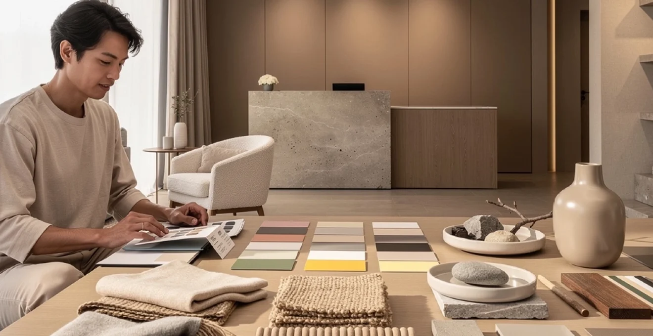
Once the neutral colour framework is established, texture and material choice become the primary tools for elevating the scheme. In a restrained palette, every surface gains more importance, as the eye reads variations in weave, sheen, and relief in place of strong colour contrast. This is why seemingly simple neutral interiors often rely on an intricate mix of finishes: open-weave textiles, hand-trowelled plaster, honed stone, and softly burnished metals. Used together, these elements generate a rich sensory experience that feels luxurious even when the colour story remains quiet.
From a design strategy perspective, it is helpful to think of neutrals as the “score” and materials as the “instruments.” The same base colour can feel rustic, formal, or ultra-modern depending on whether it is rendered in rough-sawn oak, polished marble, or powder-coated metal. By deliberately combining complementary materials—soft against hard, matte against gloss, organic next to engineered—you transform a neutral palette into a space with rhythm and personality.
Natural fibre integration: linen, wool, and jute layering techniques
Natural fibres are indispensable when you want neutral décor to feel tactile rather than sterile. Linen, with its visible slubs and relaxed drape, introduces an effortless softness that counters the linearity of modern architecture. Wool, especially in boucle or thick pile rugs, provides warmth and acoustic absorption, making neutral living rooms and bedrooms feel cocooning. Jute and sisal offer a dry, earthy texture underfoot that grounds pale schemes and connects them to nature, especially when paired with timber or stone.
Layering these fibres is more effective than relying on a single material throughout. For example, you might combine linen curtains, a wool sofa, and a jute rug within the same beige-and-stone colour story to create depth without visual noise. Varying scale is crucial: pair a tightly woven wool throw with a more open, chunky knit cushion, or contrast a fine flat-weave rug with a dense, shaggy runner in an adjacent space. This kind of textile layering is one of the most reliable ways to make a neutral room feel curated and inviting rather than unfinished.
Surface contrast methods: matte, satin, and high-gloss finishes
Finish level can be as impactful as colour choice when working with neutral interiors. Matte surfaces absorb light and reduce glare, which makes them ideal for large wall areas or ceilings where you want a calm, contemporary appearance. Satin or eggshell finishes reflect a controlled amount of light, adding a gentle glow to joinery, doors, and trim without drawing excessive attention. High-gloss elements, used sparingly, inject drama and sophistication by creating sharp highlights and reflections that punctuate the otherwise soft environment.
One effective approach is to keep the main architectural envelope—walls and ceilings—matte or low-sheen, then reserve satin and gloss for smaller, touchable elements. For instance, a stone-coloured matte wall might sit behind a satin-lacquered sideboard and a high-gloss ceramic table lamp in a similar tone. The colour remains consistent, but the interplay of finishes creates contrast and visual hierarchy. As you plan your neutral interior, consider asking: where should the eye rest, and where should it sparkle? Finish contrast gives you that level of control.
Tactile element incorporation: bouclé, cord, and raw concrete applications
Highly tactile materials act as focal points in neutral spaces, drawing people in through touch as much as sight. Bouclé, with its looped yarns and cloud-like softness, has become a contemporary favourite for sofas and accent chairs in off-white or stone hues. Corduroy and wide-wale cord fabrics introduce linear texture and a subtle retro reference, particularly effective on cushions or ottomans in caramel or mushroom tones. Raw concrete, whether used on floors, countertops, or feature walls, offers an industrial counterpoint that prevents overly soft neutrals from feeling saccharine.
The key is balance: too much bouclé and cord can feel heavy or visually cluttered, while an overreliance on concrete risks coldness. A successful composition might pair a bouclé armchair with a smooth leather ottoman and a refined concrete side table, all within the same restrained palette of greige and clay. Think of these tactile elements as punctuation marks in your neutral narrative—you do not need many, but they must be placed with intent.
Mixed media approaches: metal, wood, and stone juxtaposition
Mixed media combinations bring nuance and sophistication to neutral design by exploiting the natural qualities of different materials. Warm metals such as brass and bronze introduce a subtle glow that complements beige, cream, and taupe, while cooler metals like brushed nickel and stainless steel pair beautifully with blue-greys and stone tones. Timber, whether pale oak or dark walnut, anchors spaces emotionally and visually, making them feel lived-in rather than showroom-perfect. Stone, from honed limestone to textured slate, adds geological depth and a sense of permanence.
When you juxtapose these materials deliberately, each enhances the others. Consider a light greige room where a pale oak floor meets a limestone hearth, both offset by blackened steel fixtures and a softly patinated brass lamp. The colours remain firmly neutral, yet the room feels layered and expressive because the materials tell different stories. As a general guideline, aim for at least three distinct material types in any key zone—perhaps wood, metal, and fabric in a seating area, or stone, glass, and timber in a kitchen—to achieve a balanced mixed-media composition.
Lighting design strategies for neutral tone optimisation
Lighting is arguably the most critical factor in determining whether neutral tones feel luxurious or lifeless. Because neutrals respond so sensitively to shifts in light temperature and intensity, a well-considered lighting design plan can dramatically elevate even the simplest colour scheme. Rather than depending on a single central fitting, contemporary interior designers favour layered lighting: ambient, task, and accent sources working together to support both function and mood. This layered approach prevents neutral rooms from appearing flat at night or overly stark during the day.
First, evaluate the quality of natural light entering the space. North-facing rooms often benefit from warmer lamp temperatures (around 2700–3000K) to counteract cool daylight, while south-facing spaces can handle slightly cooler white light without becoming harsh. Next, position ambient lighting—such as recessed downlights or soft-diffused pendants—to provide even base illumination without creating distracting hotspots. Task lighting, including desk lamps, reading lights, and under-cabinet strips, should then be added where specific activities occur, ensuring that neutral surfaces remain practical as well as beautiful.
Accent lighting is where neutral interiors truly come to life. Wall washers can graze textured plaster or stone, emphasising subtle relief that might otherwise go unnoticed. Picture lights or directional spots highlight artwork, sculptural objects, or a favourite piece of timber furniture, adding focal points to an otherwise quiet palette. You might ask yourself: what elements of this room deserve a spotlight, and which should recede into soft shadow? By answering this question with targeted accent lighting, you introduce depth and drama without resorting to bold colour.
Finally, consider incorporating dimming controls and multiple circuits so that the space can transition smoothly from bright, functional daytime settings to intimate evening scenes. In neutral schemes especially, the ability to modulate light levels keeps the environment from feeling static. A room painted in the same mushroom tone can feel crisp and energetic at 100% output, then warm and enveloping when lights are lowered and table lamps take over. Thoughtful lighting transforms neutral décor from a static backdrop into a dynamic, responsive environment.
Contemporary case studies: successful neutral palette implementations
Seeing neutral palettes applied in real-world projects is one of the most effective ways to understand their full potential. Across residential, hospitality, and retail design, leading studios are using neutral colour schemes not as an absence of personality, but as a deliberate strategy to focus attention on form, light, and materiality. By examining a few key typologies, we can extract practical principles that you can adapt, whether you are planning a compact apartment or a commercial interior.
Common threads emerge across these case studies: carefully calibrated undertones, robust texture layering, and nuanced lighting are present in almost every successful example. Just as importantly, each project uses neutrality to support a specific narrative—serenity in a spa-like home, quiet luxury in a boutique hotel, or product-led focus in a retail environment. Neutral tones become the language through which that story is told, proving that “boring” is often simply a matter of poor execution rather than inherent limitation.
Residential projects: minimalist scandinavian and japanese Wabi-Sabi influences
Scandinavian-inspired interiors remain a benchmark for how to execute light, airy neutral schemes that still feel warm and human. Typical palettes centre on soft whites, pale greys, and light oak, with occasional charcoal accents for definition. The success of these spaces lies in their disciplined approach to clutter, reliance on natural materials, and prioritisation of daylight. Floors are often continuous timber or pale concrete, walls stay quietly off-white, and textiles in linen and wool add tactile variation without competing for attention.
Japanese Wabi-Sabi interiors, meanwhile, demonstrate how darker and more complex neutrals can create contemplative, grounded homes. Here, we see mushroom, ink, clay, and weathered wood tones, often combined with visible imperfections—cracked ceramics, knotty timber, or hand-rendered plaster. The philosophy embraces transience and imperfection, making neutral colours feel deeply personal rather than generic. A living room might feature a low charcoal sofa, a rough-hewn oak table, and a clay-toned wall, all bathed in gentle, indirect light that softens edges and celebrates texture.
Hybrid “Japandi” schemes blend the best of both influences: Scandinavian lightness with Japanese depth. For instance, a pale oak floor and off-white walls set a bright foundation, while a single feature wall in warm greige, a blackened steel floor lamp, and a stone-coloured linen sofa introduce grounded contrast. The result is a neutral home that feels both calm and characterful, proving that minimalism need not equate to clinical or impersonal design.
Commercial spaces: hotel and restaurant neutral branding applications
In the hospitality sector, neutral palettes are frequently used to express a sense of timeless luxury and broaden guest appeal across demographics. Boutique hotels often rely on layered neutrals—stone, biscuit, charcoal, and soft white—to create rooms that feel restful after travel and adaptable to different personal styles. Instead of branded colour blocks, you will find subtle references in accent cushions, artwork, or amenities, leaving the primary architectural surfaces elegantly understated. This approach also extends the lifespan of the interior, as neutral backdrops remain relevant even as branding evolves.
Restaurants use neutral design in more nuanced ways, depending on their desired atmosphere and turnover rate. Fine-dining venues might lean into deep taupes, espresso browns, and dim, warm lighting to encourage lingering, with tableware and linens providing lighter accents in ivory or stone. More casual, high-turnover spaces may opt for lighter greiges and warm whites to keep the environment bright and approachable, adding texture through timber banquettes, woven seats, and stone counters. In both cases, neutral tones support the true focal point of the space: the food and the social experience.
These commercial case studies highlight an important principle: in brand-led environments, neutral interiors act as a stage set rather than the main performer. By avoiding loud, dated colour schemes, hotels and restaurants maintain the flexibility to update artwork, textiles, and styling elements without undertaking major renovations. For designers and business owners alike, this translates into both aesthetic longevity and financial efficiency.
Retail environment design: luxury brand neutral merchandising strategies
Luxury retailers have long understood that neutral spaces allow products to shine. Flagship fashion boutiques and high-end jewellery stores frequently employ palettes of soft grey, champagne, stone, and black to establish a calm, gallery-like atmosphere. The neutrality ensures that handbags, garments, and precious metals read true to colour, which is crucial when customers are making high-value purchasing decisions. Clean-lined joinery in pale oak or lacquered taupe, combined with plush neutral carpeting, guides the eye naturally towards the merchandise.
Visual merchandising strategies in these spaces rely heavily on contrast within the neutral range. For example, a display of brightly coloured accessories might be set against a deep charcoal backdrop, while more muted items sit in pale niches that echo their tones. Reflective materials such as glass and polished metal introduce sparkle and light play, while soft fabrics like suede or velvet in stone or mushroom add tactility at touchpoints. The overall effect is one of understated opulence, where the store environment supports rather than competes with the brand’s products.
Even mid-market retailers are adopting elements of this approach, moving away from heavily themed colour schemes towards more pared-back, flexible interiors. For you as a designer or homeowner, these retail examples reinforce a key takeaway: neutral design can be both aspirational and practical, offering a high-end feel that adapts gracefully as tastes and collections change.
Advanced colour matching and specification techniques
Translating a conceptual neutral palette into built reality requires precise colour matching and specification. Subtle differences between paint brands, batch numbers, and lighting conditions mean that relying on digital swatches or small paper samples is rarely sufficient. Instead, professional designers work with large-format sample boards, often painted with at least two coats, to test colours in situ. This allows accurate assessment of undertones, sheen, and relationships with adjacent materials such as flooring, tiles, and fabric.
When specifying neutrals for complex projects, it is useful to establish a controlled vocabulary of key tones: a primary wall colour, a contrasting or complementary trim shade, one or two accent neutrals for joinery or feature walls, and a small selection of deep anchors (such as charcoal or off-black). Document these colours with exact product codes, sheen levels, and application areas to avoid ambiguity during construction. In multi-phase projects, keep a record of batch numbers and suppliers so that touch-ups or future extensions remain visually consistent.
Digital tools are increasingly important in advanced neutral specification. Colour calibration devices and professional monitors help ensure that design visuals presented to clients match the final outcome as closely as possible. Some design teams build digital libraries of “approved” neutral combinations—tested under different lighting scenarios—so that future projects benefit from accumulated knowledge. However, even with sophisticated software, physical sampling remains non-negotiable; the way a mushroom grey appears on screen can differ markedly from how it reads on a textured plaster wall.
Finally, consider how your neutral specifications will age. Will a heavily cool grey still feel relevant in ten years, or would a warmer greige offer more longevity? Are you selecting a floor finish that can be refinished or adjusted as trends evolve around it? Approaching neutral design with this long-term mindset ensures that your spaces remain elevated and engaging far beyond the initial installation, proving that carefully considered neutrals are not merely “safe,” but strategically smart.