The art of colour coordination in fashion extends far beyond simply matching your handbag to your shoes. Modern style enthusiasts understand that strategic accessory coordination can transform a basic outfit into a sophisticated ensemble that reflects personal taste and professional acumen. Mastering the nuances of colour harmony between clothing and accessories requires understanding fundamental design principles, developing an eye for complementary relationships, and learning when to break traditional rules for maximum visual impact. Whether you’re building a professional wardrobe or exploring creative self-expression through fashion, the ability to coordinate colours effectively elevates your overall aesthetic presence and ensures every element of your outfit works in harmonious unity.
Colour theory fundamentals for fashion coordination
Understanding colour theory provides the foundation for creating visually appealing outfit combinations that feel intentional rather than accidental. The traditional colour wheel serves as your primary navigation tool, revealing relationships between different hues and helping you make informed decisions about which accessories will enhance rather than compete with your clothing choices. This systematic approach to colour selection eliminates guesswork and builds confidence in your styling decisions.
Primary, secondary, and tertiary colour relationships in wardrobe planning
Primary colours—red, blue, and yellow—form the base of all colour relationships and offer bold, confident statement options for accessory coordination. When working with primary colours in your outfit, consider how secondary colours (green, orange, purple) created by mixing primaries can provide sophisticated balance. Tertiary colours, which blend primary and secondary hues, often provide the most wearable and flattering options for everyday styling. These nuanced shades, such as teal, coral, or plum, work exceptionally well in accessories because they offer visual interest without overwhelming the overall look.
The key to successful primary colour coordination lies in understanding proportion and placement. A navy dress paired with coral earrings demonstrates how complementary primary and secondary relationships create visual harmony. Similarly, a yellow blouse can be beautifully enhanced with purple accessories, creating a sophisticated take on complementary colour pairing that feels modern rather than matchy.
Chromatic temperature assessment: warm versus cool undertones
Colour temperature significantly impacts how accessories interact with your clothing and, more importantly, with your natural colouring. Warm undertones lean towards yellow, orange, and red bases, while cool undertones contain blue, green, or purple elements. Understanding your personal undertone preference guides accessory selection and ensures your choices enhance rather than clash with both your outfit and complexion.
When coordinating warm-toned clothing with accessories, gold metallics, coral jewellery, and earth-toned handbags create cohesive ensembles. Cool-toned outfits benefit from silver accessories, jewel-toned scarves, and bags in navy or charcoal. However, strategic temperature mixing can create dynamic visual interest—a cool grey dress paired with warm cognac leather accessories demonstrates how contrasting temperatures can complement each other when balanced properly.
Saturation levels and intensity matching techniques
Saturation refers to the purity and intensity of colour, ranging from highly saturated (bright, vivid) to desaturated (muted, greyish). Matching saturation levels between clothing and accessories creates visual cohesion, while contrasting saturation levels can add depth and sophistication to your ensemble. High-saturation accessories work beautifully with neutral clothing, while muted accessories complement bold, saturated garments.
Consider how a bright turquoise necklace transforms a simple black dress—the high saturation of the accessory against the neutral base creates a focal point without overwhelming the look. Conversely, dusty rose accessories paired with a vibrant emerald top demonstrate how lower saturation accessories can soften and balance intense clothing colours.
Complementary colour pairings using the traditional colour wheel
Complementary colours sit opposite each other on the colour wheel and create the highest contrast relationships. These pairings—red and green, blue and orange, purple and yellow—naturally draw the eye and create dynamic visual interest. When working with complementary relationships in accessory coordination, consider using one colour as the dominant tone in your clothing and the complementary colour as an accent in your accessories.
Strategic use
Strategic use of complementary colour accessories works best in controlled doses. Instead of matching every accessory to the contrasting shade, choose one or two focal points—for example, cobalt heels with an orange dress, or a mustard clutch with a deep violet jumpsuit. This approach gives you the drama of high contrast without tipping into chaos. If you’re unsure, anchor the look with a neutral such as black, navy, tan, or cream, then let a single complementary accessory carry the statement.
Monochromatic styling strategies for seamless accessory integration
Monochromatic outfits—looks built from different variations of a single colour—offer one of the most sophisticated ways to coordinate your accessories with your outfit colours. Because there is less competition between hues, you can focus on nuance: depth, texture, shine, and proportion. A well-executed monochromatic ensemble can elongate your silhouette, look instantly polished, and serve as the perfect backdrop for thoughtfully chosen accessories.
Tonal variation methods within single colour families
Working within a single colour family doesn’t mean every piece must be an exact match. In fact, intentional tonal variation is what keeps a monochromatic outfit from feeling flat or “uniform-like.” Think of your chosen colour as a spectrum: light, medium, and dark versions of the same hue. By combining these tones across clothing and accessories, you create visual dimension while maintaining harmony.
For example, imagine a soft camel coat over a beige knit dress, finished with a deeper tan belt and cognac leather bag. All the elements belong to the same brown family, yet the shift in depth between light and dark shades adds quiet sophistication. You can apply the same method to blues (sky, denim, navy), greens (sage, olive, forest), or even bolder families like reds and pinks. When in doubt, keep the largest pieces (dresses, trousers, coats) in mid-tone shades and use lighter or darker accessories to sculpt the look.
Texture contrast techniques for monochromatic ensembles
When colour remains consistent, texture becomes your main tool for interest. Think of texture like different “voices” in the same choir—each one distinct, but all singing the same song. Combining matte and glossy surfaces, soft and structured materials, or smooth and tactile finishes gives a monochromatic outfit richness and depth without disrupting your colour story.
You might pair a matte wool blazer with a silk camisole, suede boots, and a patent leather clutch, all in similar shades of charcoal. The contrast between soft and shiny, structured and fluid, keeps the eye moving. Jewellery plays a key role here too: a beaded necklace, hammered metal earrings, or a smooth resin bangle in the same hue can echo your clothing colour while introducing a new surface quality. If you ever feel your monochrome look seems “too plain,” texture is usually the missing ingredient.
Metallic accent selection for neutral monochromatic schemes
Neutral monochromatic outfits—built from black, white, grey, navy, beige, taupe, or cream—are the perfect canvas for metallic accessories. Because neutrals recede visually, metal tones act like subtle highlights, adding structure and polish. Choosing the right metallic accent comes down to temperature, contrast, and mood. Warm neutrals such as camel, tan, or chocolate pair beautifully with gold, bronze, or rose gold, while cool neutrals like grey, black, and navy often shine with silver, gunmetal, or platinum finishes.
If you prefer a minimalist aesthetic, you can limit yourself to one dominant metal throughout your look—say, a silver watch, silver hoop earrings, and a bag with silver hardware. This creates a cohesive, almost architectural feel. For a more fashion-forward approach, consider mixed metals in small doses: layered necklaces in gold and silver against a black dress, or a rose gold bracelet stacked with a steel-toned watch. As a rule of thumb, keep metallic accessories in proportion to your outfit’s formality; finer, delicate pieces work best for professional settings, while bolder, chunkier metals feel at home in evening or creative environments.
Pattern mixing within monochromatic colour palettes
Monochrome doesn’t have to mean plain. In fact, mixing patterns within a single colour palette is one of the safest ways to experiment with prints while still coordinating your accessories with your outfit colours. Because the hues are unified, the eye reads the outfit as cohesive even when the prints differ. The trick lies in scale and balance: pairing one larger pattern with one smaller, more subtle pattern generally produces the most wearable result.
Consider a navy pinstripe blazer layered over a navy-and-ivory polka dot blouse, finished with a solid navy trouser. Add accessories that reference the same palette—a navy bag, navy pumps, and perhaps a bracelet or earrings that pick up the ivory tone. The prints add energy, but the monochrome base and carefully matched accessories keep everything controlled. If you’d like to push the concept further, a tonal animal print belt or scarf in the same colour family can act as a focal accessory without breaking the overall colour scheme.
Advanced colour matching systems and professional tools
Once you’re comfortable with basic colour theory, you can refine your outfits further using the same tools stylists, designers, and image consultants rely on. Advanced colour matching systems help you move from “this looks okay” to “this looks intentional and refined.” These tools—ranging from Pantone swatches to mobile colour apps and seasonal analysis systems—allow you to coordinate your accessories with your outfit colours with a level of precision that feels almost scientific, while still leaving room for personal taste.
Pantone colour matching system applications in personal styling
The Pantone Colour Matching System, widely used in fashion and design, offers a standardized language for colour. While you don’t need to memorise Pantone codes to get dressed in the morning, understanding how they work can dramatically improve your ability to shop for accessories that truly match or complement your clothes. Many fashion brands and cosmetics companies reference Pantone shades when developing collections, meaning you can often trace a particular bag colour or lipstick back to a defined swatch.
How does this help you in practice? If you know that a favourite blazer aligns with a particular Pantone shade, you can look for accessories in nearby or complementary Pantone colours rather than guessing. Some retailers even call out Pantone names in their seasonal drops, especially around “Colour of the Year” campaigns. Using Pantone as a guide is similar to using GPS for travel: you can still rely on intuition, but having a map helps you reach your destination faster and with fewer missteps.
Digital colour analysis using mobile applications and tools
Today, coordinating accessories with outfit colours is easier than ever thanks to digital tools. Mobile apps can scan a photo of your clothing and return the closest colour values, then suggest complementary or analogous shades for accessories. Others let you build virtual wardrobes, test outfit combinations, and experiment with shoes, handbags, and jewellery colours before you buy. This is especially helpful if you shop mostly online and can’t compare items side by side in real life.
Think of these apps as digital fitting rooms for colour. You can upload an image of your favourite dress and see how it looks with different accessory colours on screen, much like testing paint swatches on a wall before committing. Some tools also offer personal colour analysis, helping you identify whether you suit cooler or warmer palettes based on your skin, hair, and eye colour. While no app can replace your own judgement entirely, using technology in this way reduces guesswork and helps you shop more strategically.
Seasonal colour analysis: autumn, winter, spring, summer classifications
Seasonal colour analysis—the system that classifies people into seasonal categories such as Spring, Summer, Autumn, and Winter—remains popular because it gives a clear framework for choosing harmonious colours. Each “season” corresponds to a particular mix of temperature (warm or cool), clarity (clear or soft), and depth (light or dark). For instance, Winters tend to shine in cool, crisp, high-contrast colours, while Autumns look best in warm, earthy, muted tones.
Understanding your own season can radically simplify how you coordinate accessories with outfit colours. Instead of trying every possible hue, you focus on those that align with your natural colouring. A Spring might choose coral, aqua, and light gold accessories; a Summer might favour rose, lavender, and soft silver; an Autumn could lean into olive, rust, and antique gold; and a Winter may opt for black, sapphire, and icy silver. If you’ve ever wondered why some accessory colours make you look vibrant while others drain you, seasonal analysis offers a compelling explanation.
Personal colour palette development and documentation methods
Once you have a sense of the colours that flatter you most—whether through seasonal analysis, digital tools, or simple trial and error—the next step is to capture them in a personal colour palette. This can be as simple as a set of fabric swatches kept in your bag, or as sophisticated as a professionally printed colour fan customised to your undertones. The goal is the same: to create a portable reference that helps you choose accessories and clothing that blend seamlessly.
You might photograph your favourite outfits and accessories, then group the images by colour family in a digital album. Over time, patterns emerge: perhaps you see that teal, berry, and charcoal appear often, or that gold jewellery consistently looks better on you than silver. Treat this as your living reference library. When shopping for a new handbag, scarf, or pair of shoes, you can quickly compare the item to your documented palette. This simple habit reduces impulse buys, supports a more cohesive wardrobe, and ensures that each new accessory earns its place by working with multiple existing pieces.
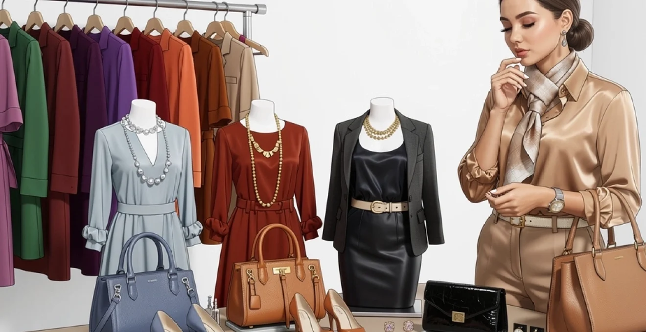
Strategic handbag and jewellery colour coordination
Handbags and jewellery are among the most powerful tools you have for tying an outfit together, yet they are also where many people feel least confident. Should your bag match your shoes, your belt, your earrings—or none of the above? The answer depends on how formal the setting is, how bold your clothing colours are, and the style statement you want to make. With a few strategic guidelines, you can move from uncertainty to intention every time you choose a bag or necklace.
As a general rule, handbags either anchor or accent your outfit. An anchoring bag is usually neutral—black, tan, navy, grey, or cream—and harmonises with most of your wardrobe. An accent bag, by contrast, deliberately introduces a strong colour: a red crossbody with a navy suit, a cobalt clutch with a black dress, or a mustard tote with a denim-and-white look. When your clothing is colourful or patterned, anchoring bags are often the safer choice. When your base outfit is neutral or simple, a statement handbag can serve as your focal accessory, doing much of the styling work for you.
Jewellery colour coordination works on similar principles but with finer detail. Delicate gold or silver pieces function almost like “visual punctuation,” giving shape and structure without changing the sentence. Bolder, coloured jewellery—turquoise earrings, a multi-stone bracelet, or a beaded necklace—acts like a highlight marker, drawing attention to specific areas and reinforcing your outfit’s dominant hues. A useful strategy is to repeat one colour from your clothing in your jewellery to create cohesion: for instance, echoing a teal print in your blouse with a teal ring, or picking up the soft pink of a floral dress with rose quartz earrings.
If you’re wearing a busy print or multiple clothing colours, select jewellery that supports rather than competes. This often means choosing metal-focused pieces or stones that match your outfit’s least dominant, more subtle shade. In a dress featuring emerald, cobalt, and white, for example, white or clear stones with gold or silver settings will help calm the look, while emerald jewellery will feel more grounded than adding yet another bright colour. On the other hand, if your clothing is understated, you can use jewellery to introduce contrast—think bold red earrings with a navy dress, or layered gold chains over a simple cream sweater.
Footwear colour selection and ensemble balancing techniques
Shoes play a unique role in colour coordination because they define the base of your silhouette. The colour you choose for your footwear can lengthen or shorten the leg line, shift the focal point up or down, and either stabilise or energise your overall palette. Have you ever tried on the same outfit with different shoes and been surprised by how dramatically the mood changed? That’s the power of strategic footwear colour selection.
For streamlined, elongating looks, choose shoes that either match your trouser or skirt colour or are close to your skin tone (for bare legs) or tight colour (for covered legs). Nude-to-you pumps with a colourful dress, for example, allow the dress to remain the star while visually lengthening your legs. Black boots with black trousers create a single, unbroken column of colour, ideal for professional or evening settings. When you want your shoes to make a statement, contrast works in your favour: red flats with a navy outfit, metallic heels with a little black dress, or emerald sandals with a white summer look draw the eye downward in a deliberate, controlled way.
Balancing footwear with the rest of your accessories comes down to distribution of colour. If your shoes are bold, consider echoing that colour once more in a smaller accessory—such as a ring, bracelet, or scarf—so the shade appears at least twice in the outfit. This repetition signals intentionality to the eye. For instance, mustard loafers combined with a printed blouse that includes a touch of mustard feel far more cohesive than mustard loafers worn with completely unrelated colours. Conversely, if your outfit already features multiple strong hues, neutral or metallic shoes will often provide the grounding element that keeps everything wearable.
It’s also helpful to think about footwear material and finish alongside colour. A matte leather boot reads more casual and grounded than a glossy patent pump, even in the same shade of black. Suede in deep jewel tones (burgundy, forest, navy) adds softness and depth to autumn and winter outfits, while smooth leather or canvas in bright colours can inject energy into spring and summer looks. As with handbags and jewellery, aim for a relationship between your shoes and at least one other element in your outfit—whether that’s colour, texture, or level of formality.
Seasonal adaptation and trend-conscious colour coordination
Colour in fashion is never static. Palettes shift with the seasons, with cultural mood, and with runway trends that eventually filter down to the high street. Learning how to coordinate your accessories with your outfit colours in a seasonally aware way allows you to keep your wardrobe feeling current without constant reinvention. You don’t need to chase every micro-trend; instead, you can use a few well-chosen accessories to nod to contemporary colours while still working within your established palette.
Seasonal adaptation begins with observing how light and landscape change throughout the year. In spring, soft pastels, fresh greens, and clear brights feel natural, making mint bags, blush shoes, or lilac earrings easy additions to lighter clothing. Summer suits saturated, sun-drenched hues; think turquoise jewellery with white dresses or coral sandals with navy linen. Autumn invites warm, earthy accessories—rust scarves, olive bags, cognac boots—to complement deeper clothing tones. Winter, by contrast, favours high-contrast combinations and jewel-toned accessories: ruby, sapphire, emerald, and icy metallics against dark or crisp neutral bases.
Trend-conscious colour coordination means selectively incorporating of-the-moment shades through accessories rather than rebuilding your wardrobe every season. If a particular colour—say, digital lavender or viva magenta—dominates fashion headlines, you can experiment with it first via a scarf, belt, or statement earrings. This is a low-risk way to test whether the trend shade harmonises with your existing clothes and your personal colouring. If it works, you might invest in a handbag or pair of shoes in that colour; if it doesn’t, you’ve still engaged with the trend without wasting budget or closet space.
Finally, remember that your personal style and lifestyle should guide how strictly you follow seasonal and trend cues. If a certain colour makes you feel confident and energised, there is little reason to restrict it to one time of year. A rich mustard bag can be styled with light denim and white in spring, with navy and stripes in summer, with burgundy and olive in autumn, and with charcoal and black in winter. Instead of thinking in rigid rules—“no white after Labour Day,” for example—focus on contextual balance: adjust depth, texture, and surrounding colours to make your favourite accessory hues feel appropriate 12 months a year.